We love the new Farrow and Ball colours, which incorporate bold brights with muted neutrals… there’s truly something for everyone! At Hamilton Stone we can match all our kitchen designs to the Farrow and Ball shades, just let us know which one is your favourite. Check out the new shades below…
School House White
Designed to evoke the style of old-fashioned school-houses, this cool, clean and crisp off-white is a beautiful one paired with a contrasting deeper shade.
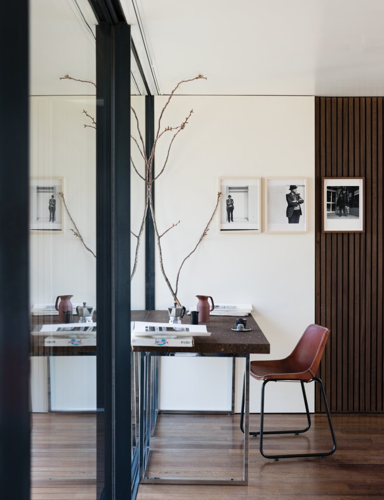
Treron
This cool-toned green is a gorgeous earthy tone to give your countryside cottage a modern twist.
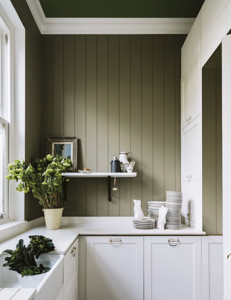
Jitney
The most neutral shade of the bunch, this modern brown-based shade looks beautiful as a wash of colour on the walls of your home.
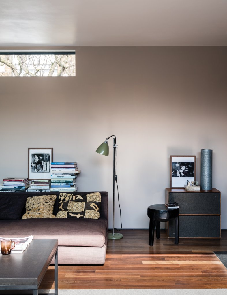
Paean Black
This deep purple-black shade gives an almost regal look to homes. Because it is so deep, it will work better in rooms with lots of natural light to keep the feeling of open space.
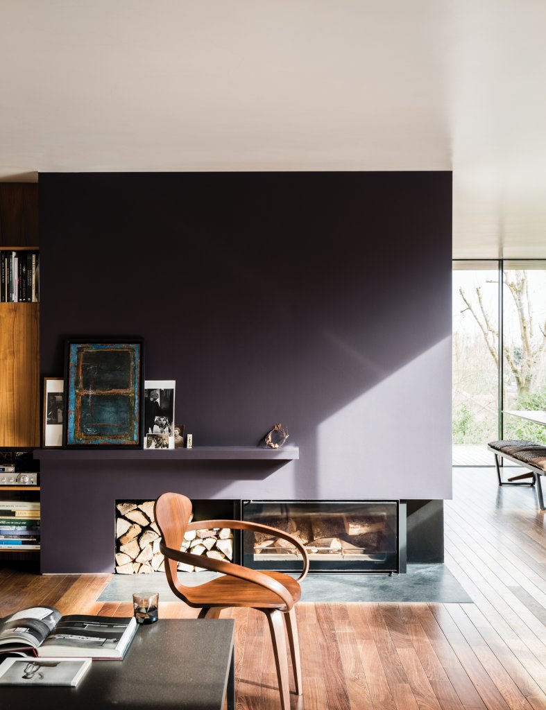
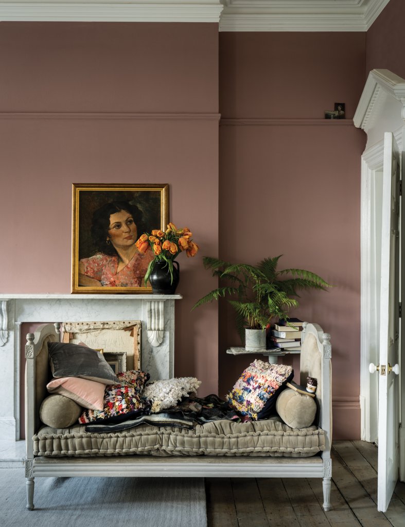
Sulking Room Pink
Now this dusty pink is one of our favourites! A very trendy shade, this gives a soft, feminine look to any room but is still neutral enough to complement your other interior decor.
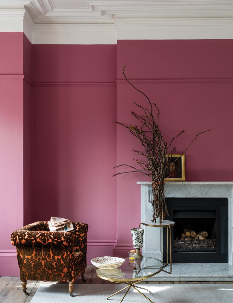
Rangwali
One of the more out-there shades, we love this bright hot pink for bringing a touch of life to any room, and the tiny amount of black pigment in this shade gives it a unique twist.
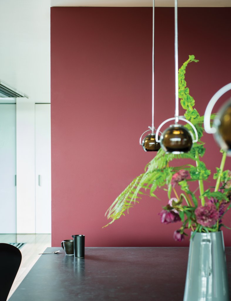
Preference Red
This rich red is perfect for homes that want to add a touch of luxe to their interior. We love the contrast here with the bright green stems!
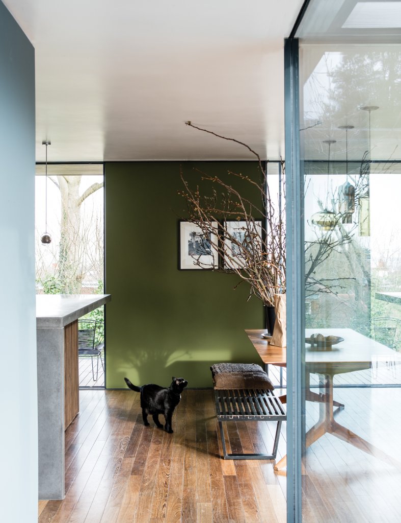
Bancha
This dark olive green is designed to give a mid-century feel to any room. Combining it with dark, warm wood tones is our favourite, as shown in this image…
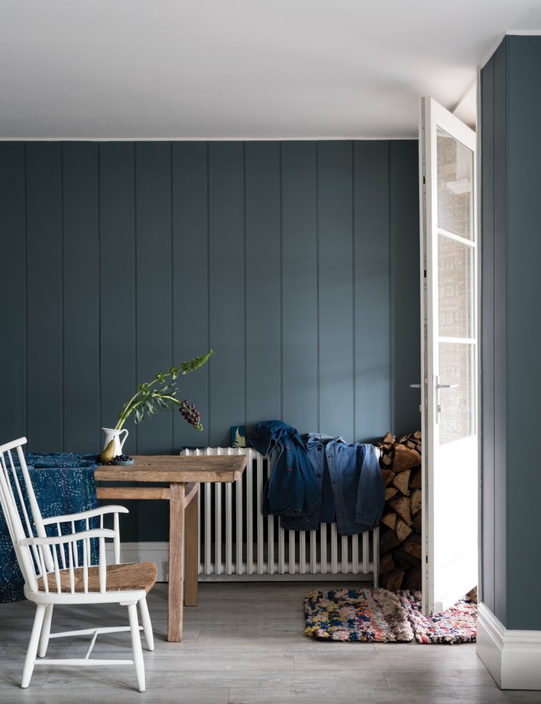
De Nimes
A soft but elegant deep blue shade, the contrast of this and SchoolHouse white would give a seaside retreat a truly classic and rustic feel.
If you’d like to incorporate one of these colours into your brand new kitchen, why not pop into our showroom to chat with one of our designers?

Comments are closed.